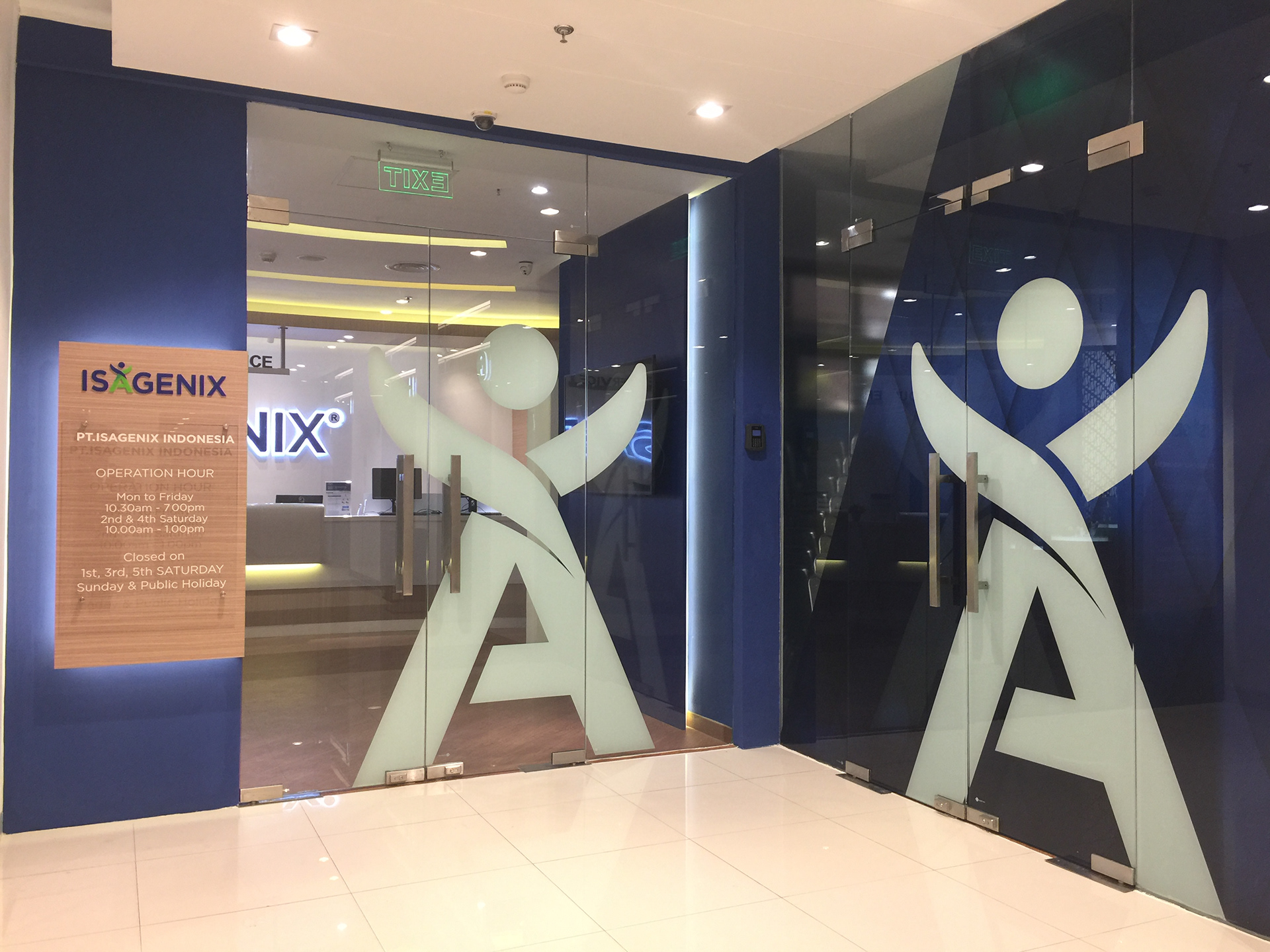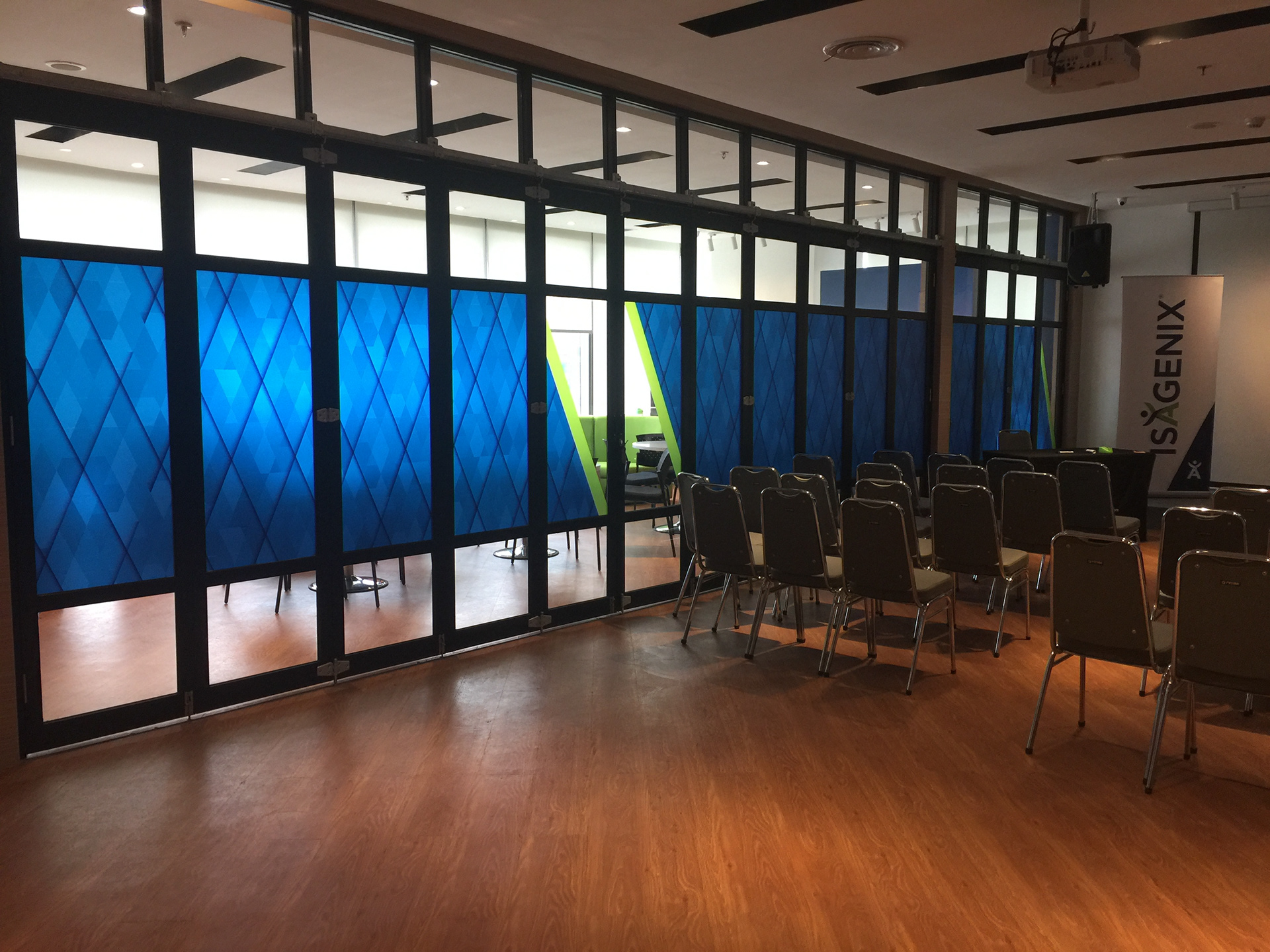
I was brought in as a contractor to support a company in implementing new brand standards that were proving difficult to apply consistently across their materials. The new branding included a recurring use of a 23.5° angle from their logo and a complex pattern of diamonds. Designers struggled to apply these elements cleanly and consistently, especially at scale and in digital formats.
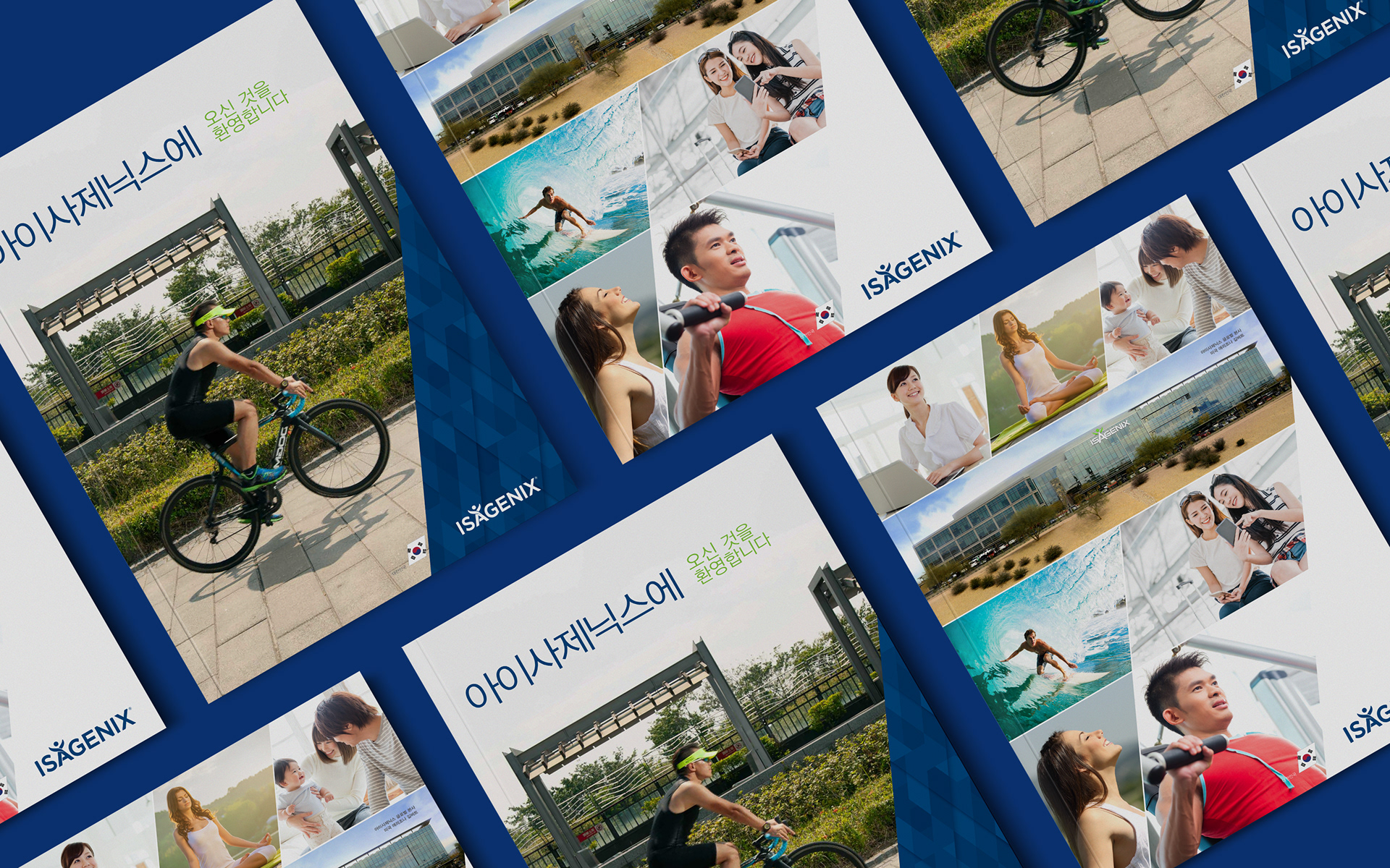
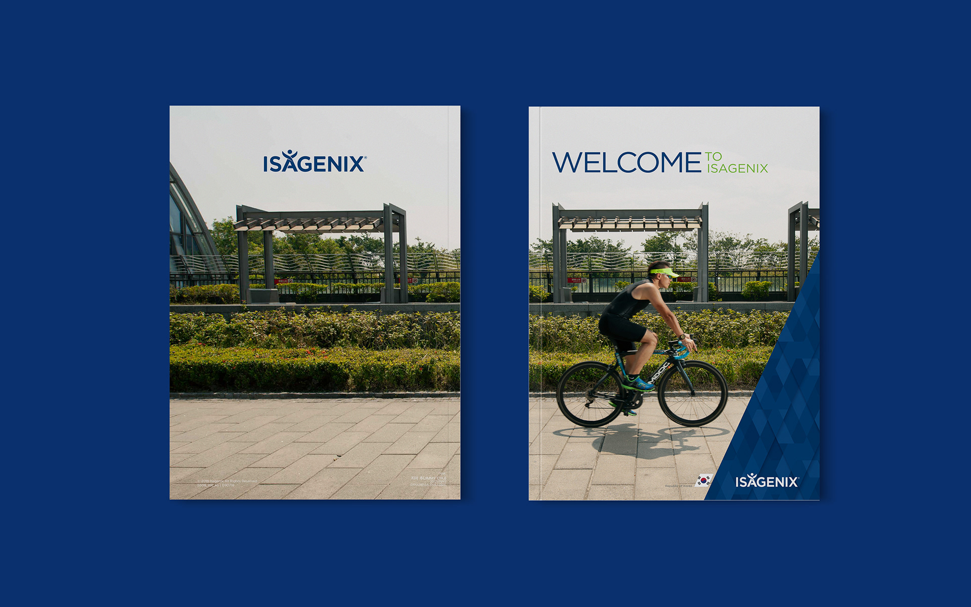
I created flexible design assets that incorporated the 23.5° angle in intuitive ways, such as masked photography and angled highlight bars. I also rebuilt the diamond pattern from scratch using a geometric grid, removing effects that interfered with scalability or digital use.
The revised elements were adopted into the brand’s core visual toolkit, solving issues of consistency and usability. Internal teams could now implement the branding system effectively across print, digital, and environmental applications.

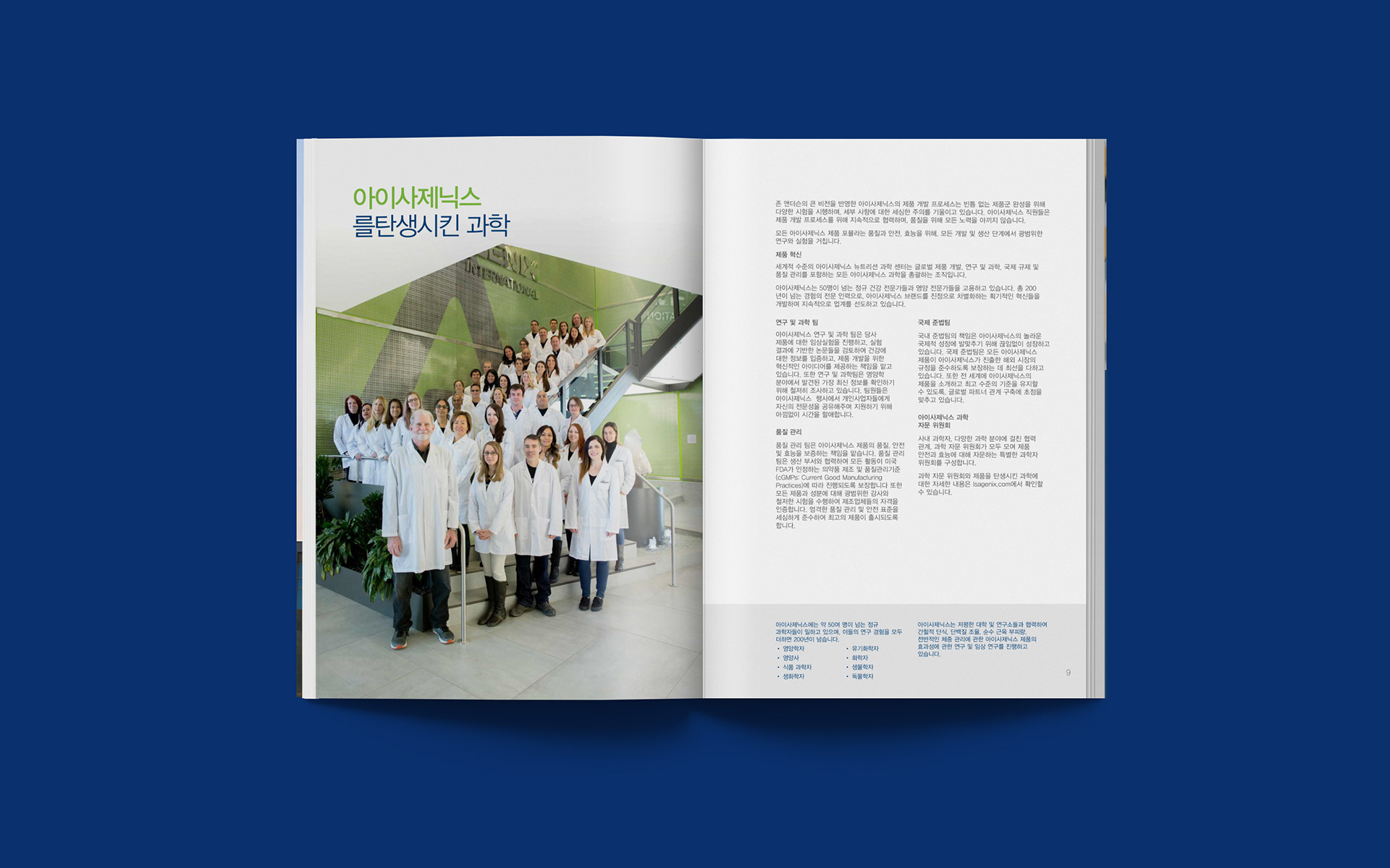
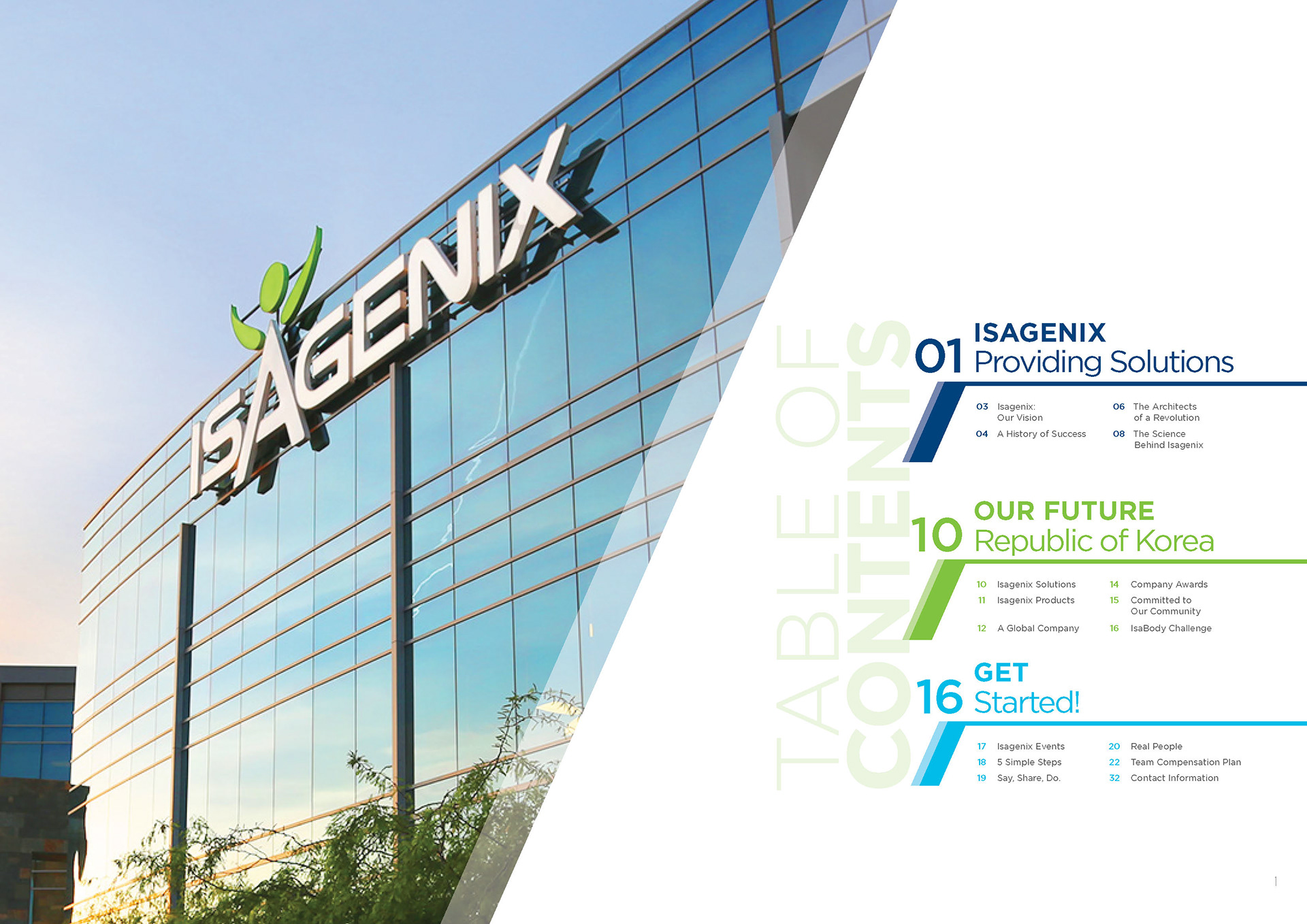


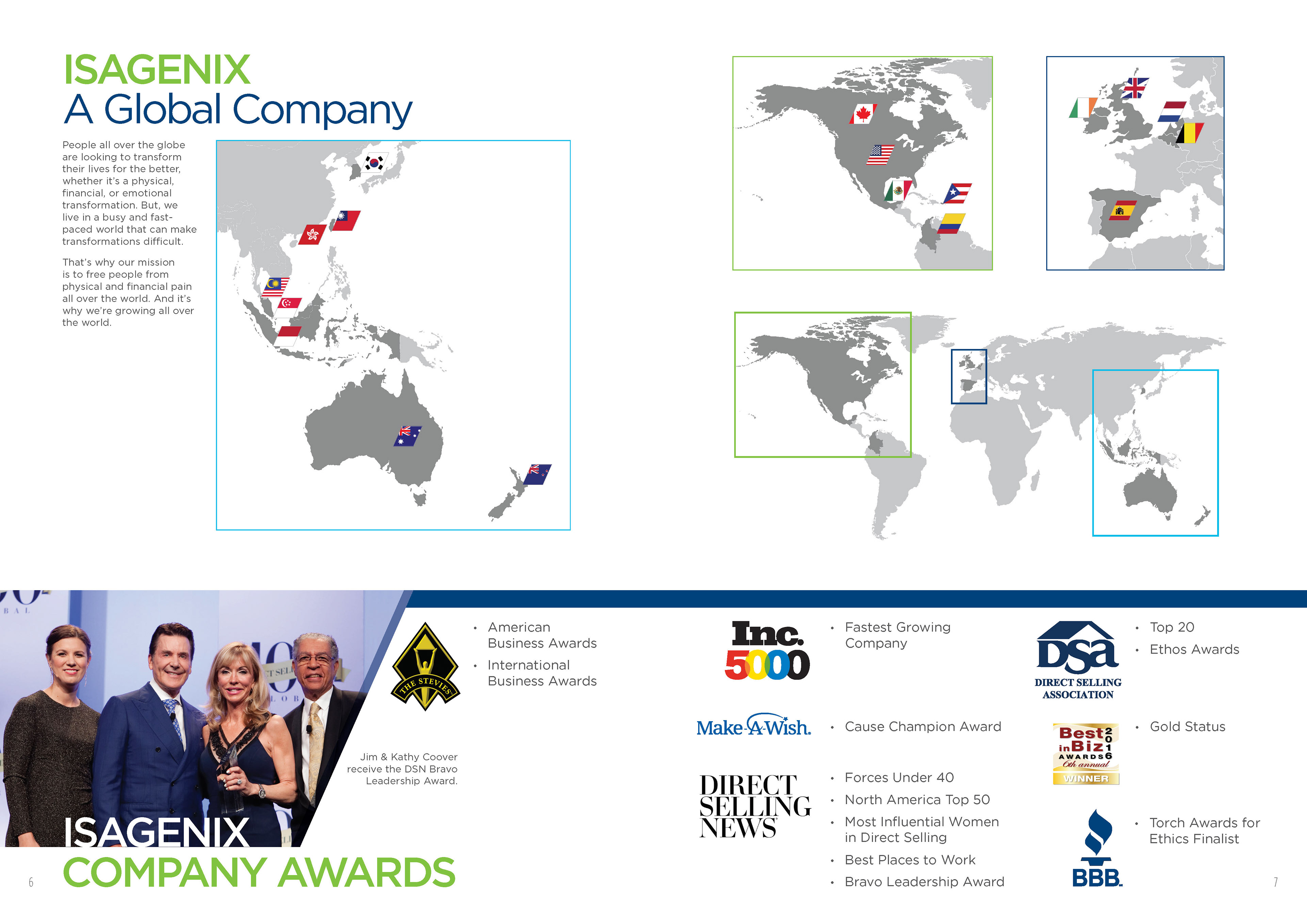
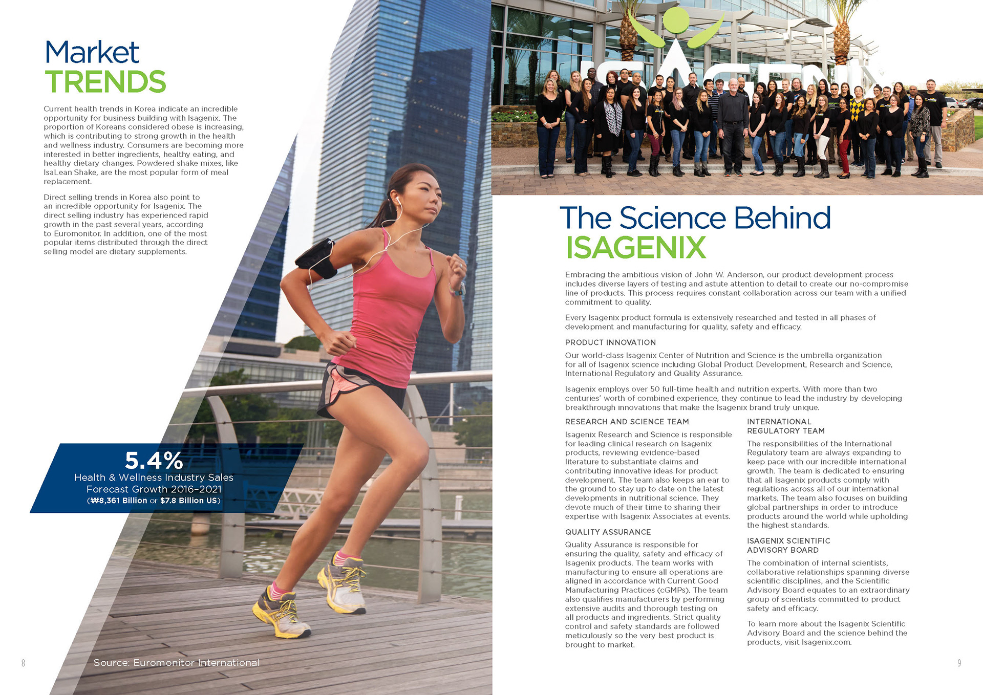
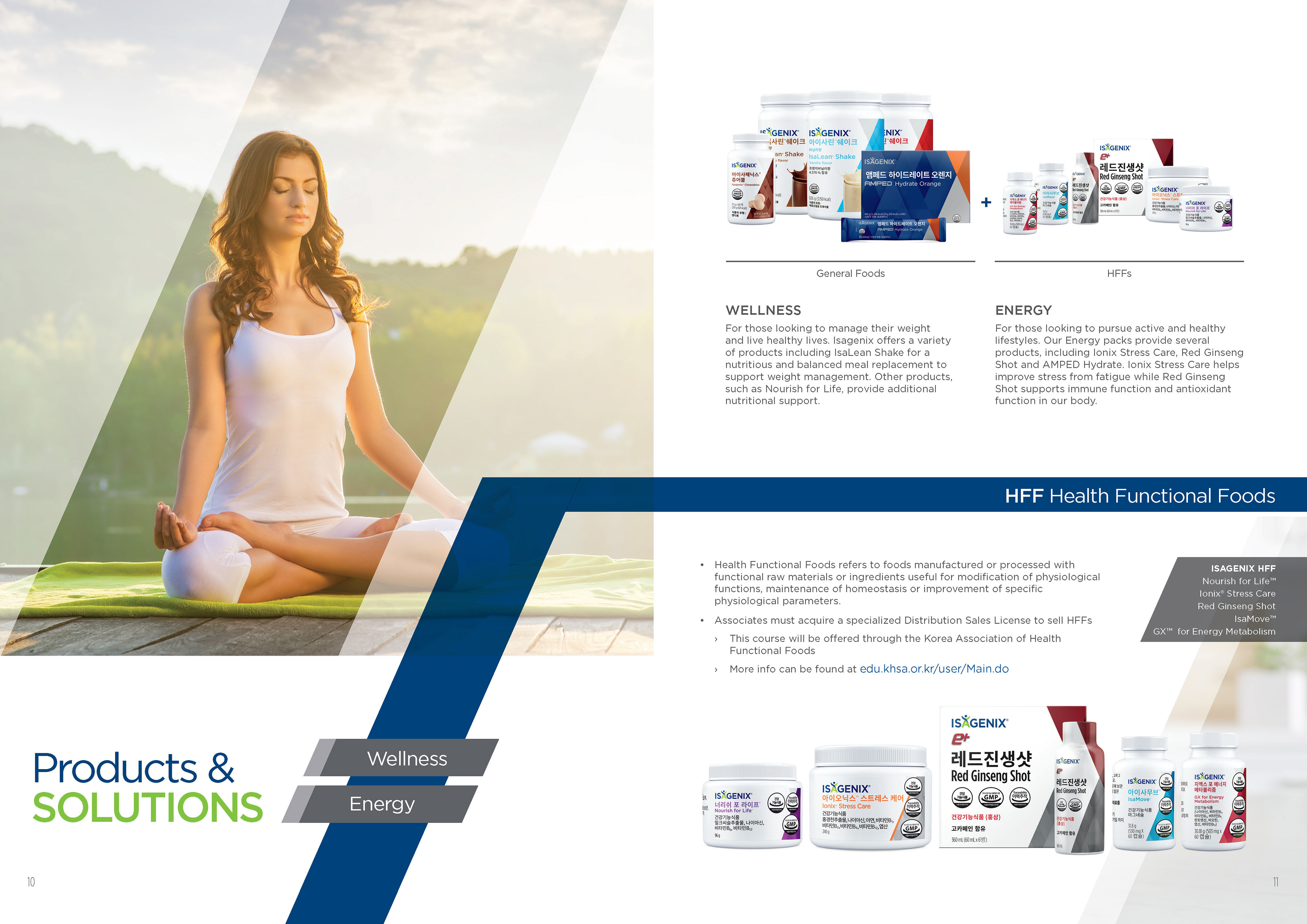

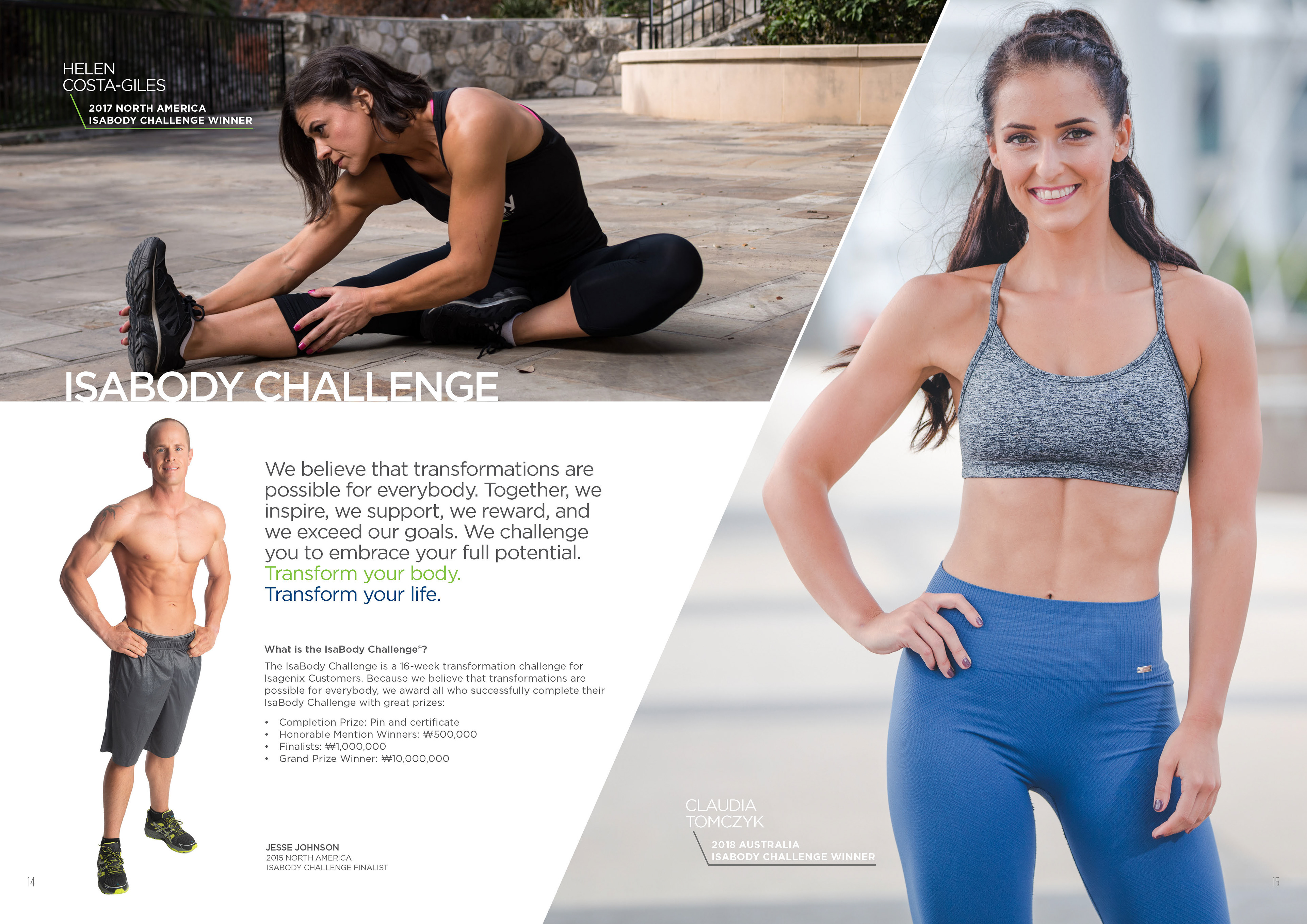

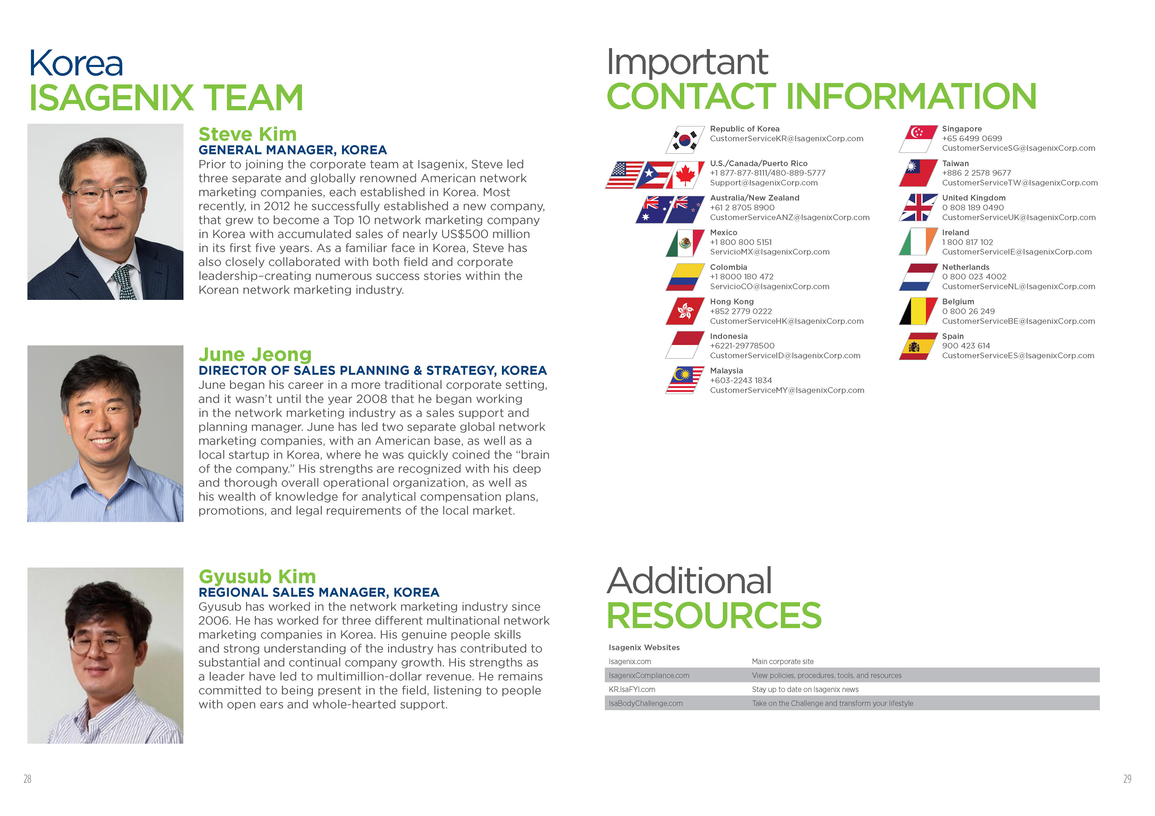
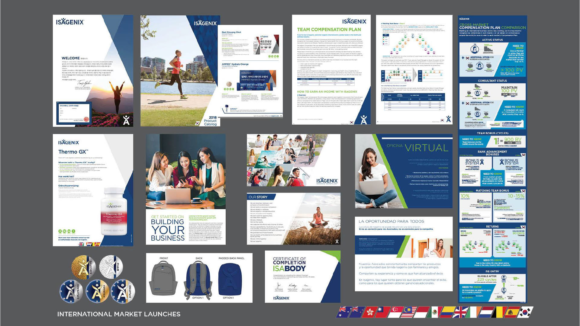
I resolved major technical issues with their repeatable brand pattern, which had been inconsistently designed by the original agency. The pattern's diamond elements were not mathematically aligned, leading to complications in large-scale environmental and digital applications. Furthermore, unnecessary shadow effects made the file unwieldy for web exports. Leveraging my experience in pattern design, I reconstructed the file with perfect geometric alignment and optimized it for scalability and digital use. These refinements ultimately became standard across Isagenix’s brand applications, ensuring both visual consistency and functional efficiency.