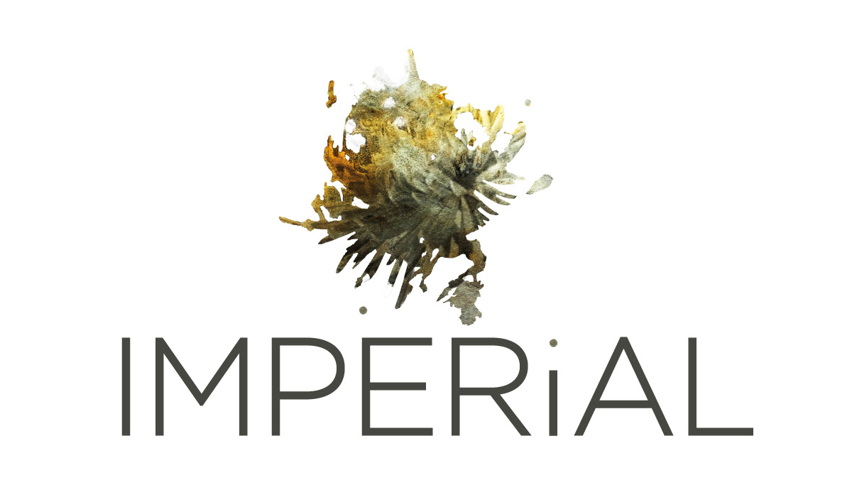
Imperial is a conceptual sake brand developed around a unique spray-painted design. The brand’s identity is rooted in the organic texture of the original artwork and draws symbolic inspiration from the chrysanthemum, an emblem of the Japanese Imperial family.
The goal was to create a premium sake brand that stood apart from typical minimalist or overly ornamental aesthetics, while maintaining a strong connection to Japanese cultural symbolism and preserving the authenticity of the original artwork.


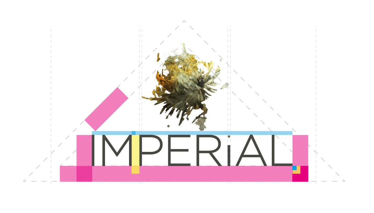
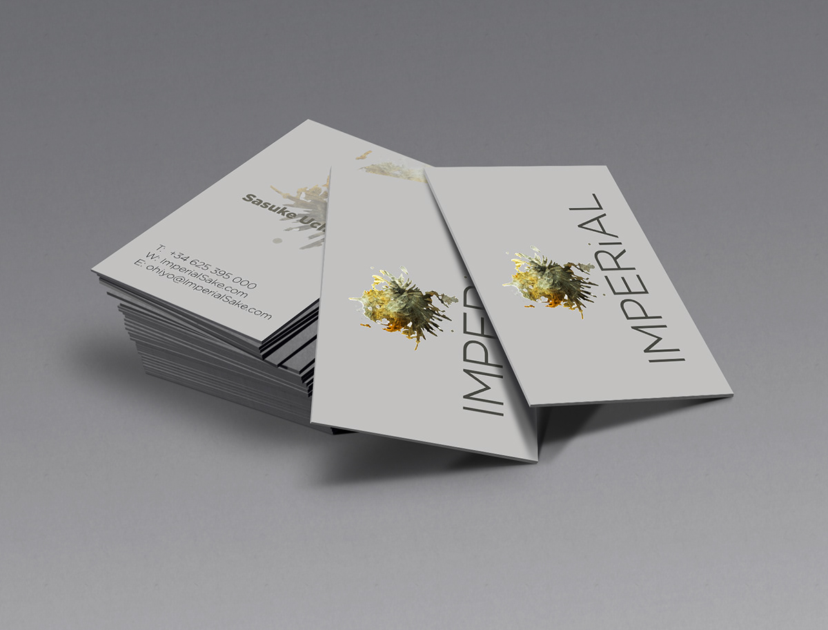
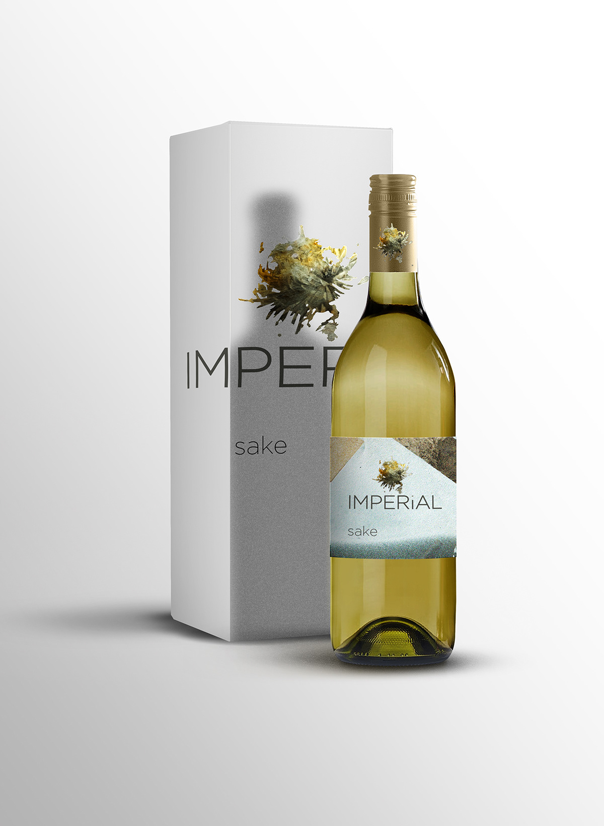
The spray-painted form, reminiscent of a chrysanthemum, became the basis of the logo. It was left largely unaltered to maintain its spontaneous, raw quality. The brand suite included custom-designed sake bottles, packaging boxes, business cards, and a promotional calendar. The calendar served both as an in-store display and as a premium giveaway for VIPs.
Imperial established a bold and tactile brand identity that merges analog artistry with symbolic tradition. The unpolished elegance of the design contributed to its visual distinctiveness and positioned it as a culturally respectful yet contemporary offering.