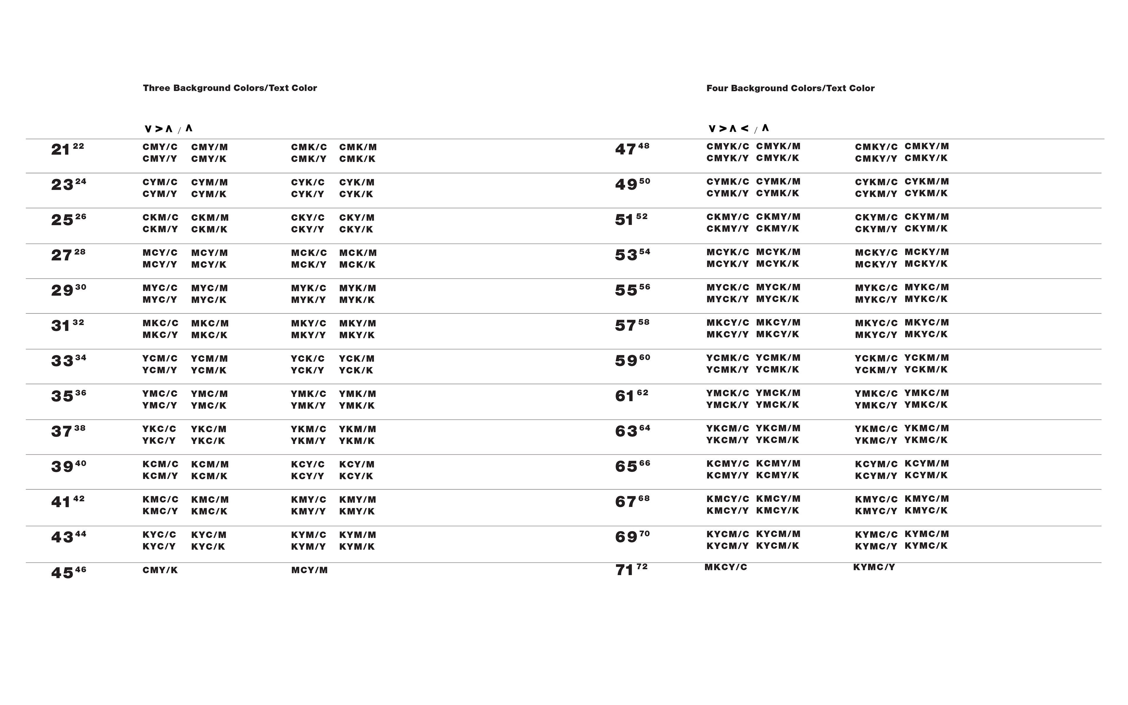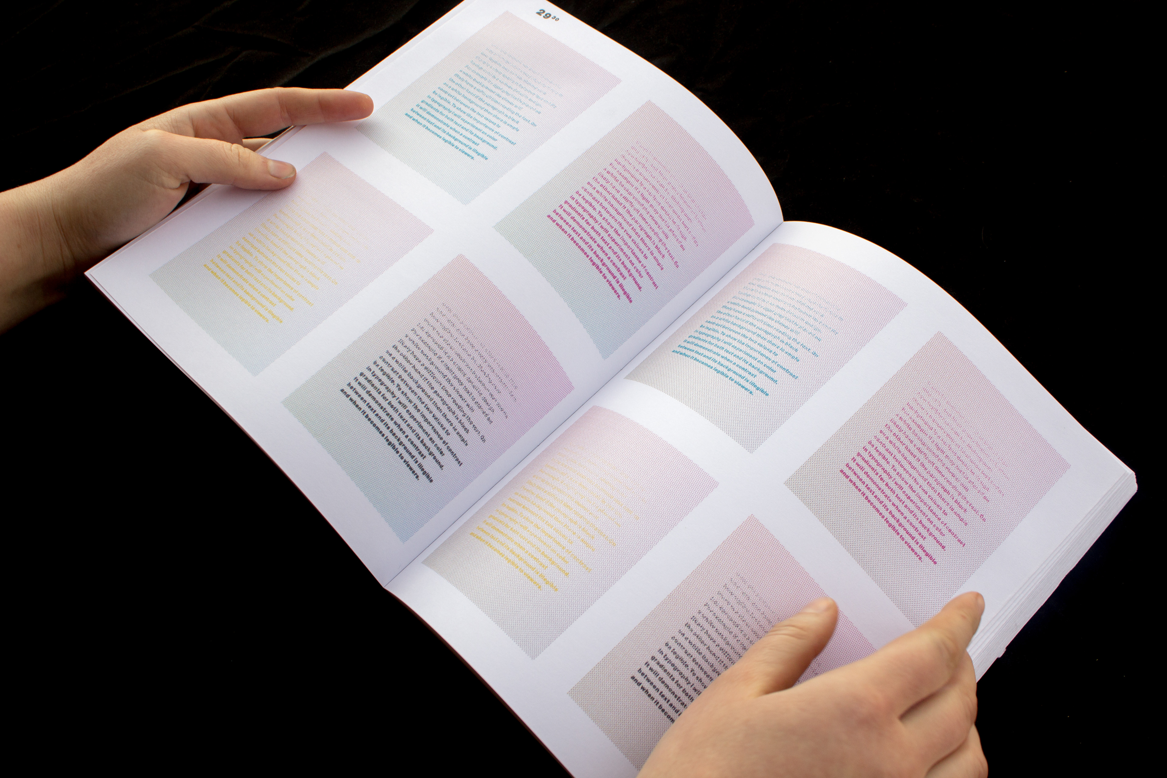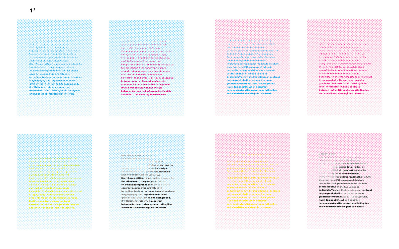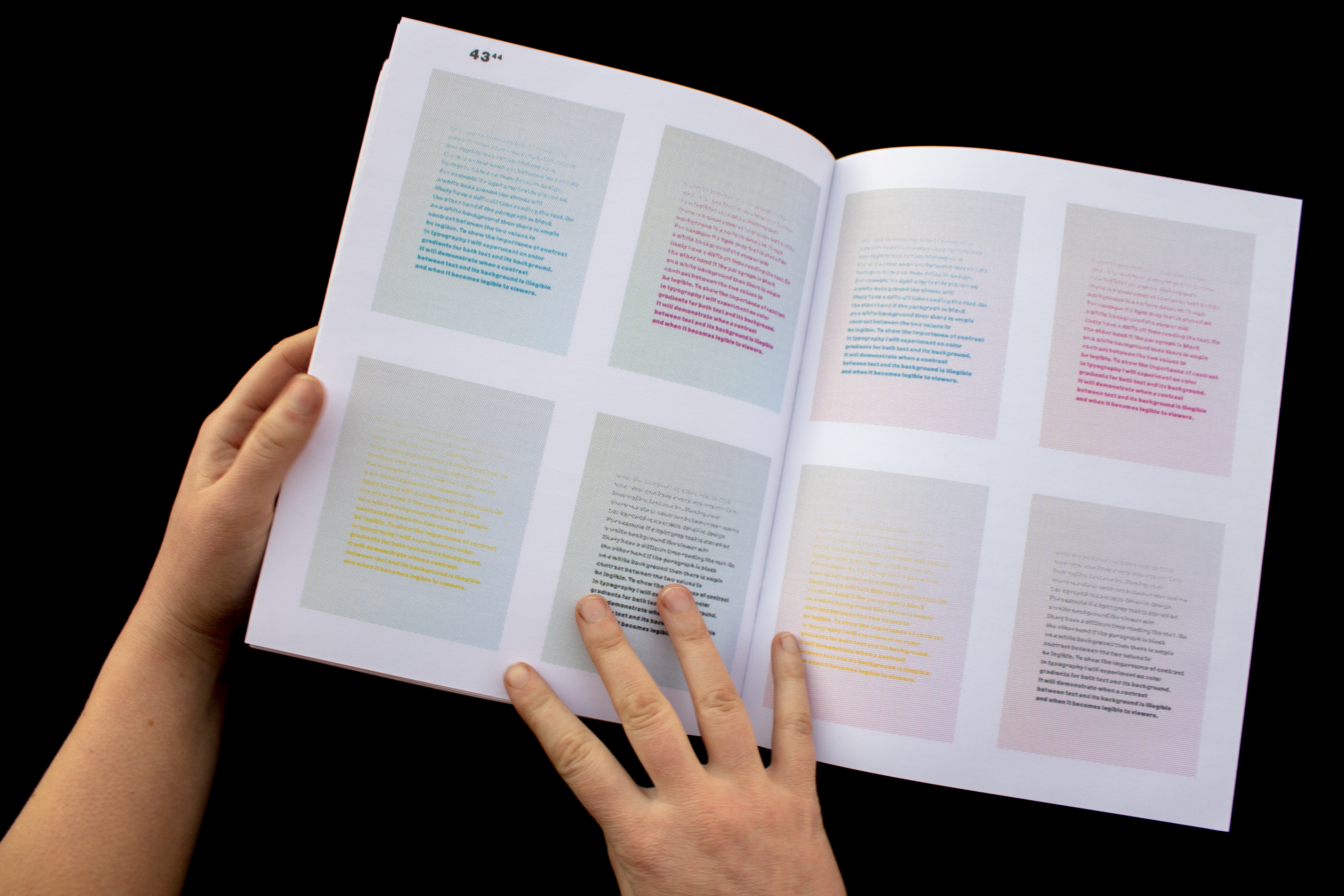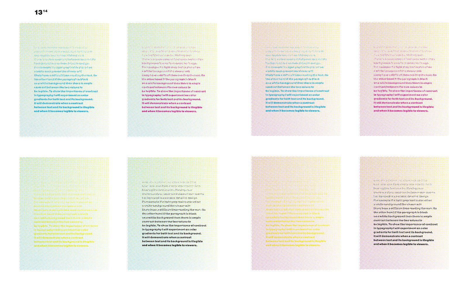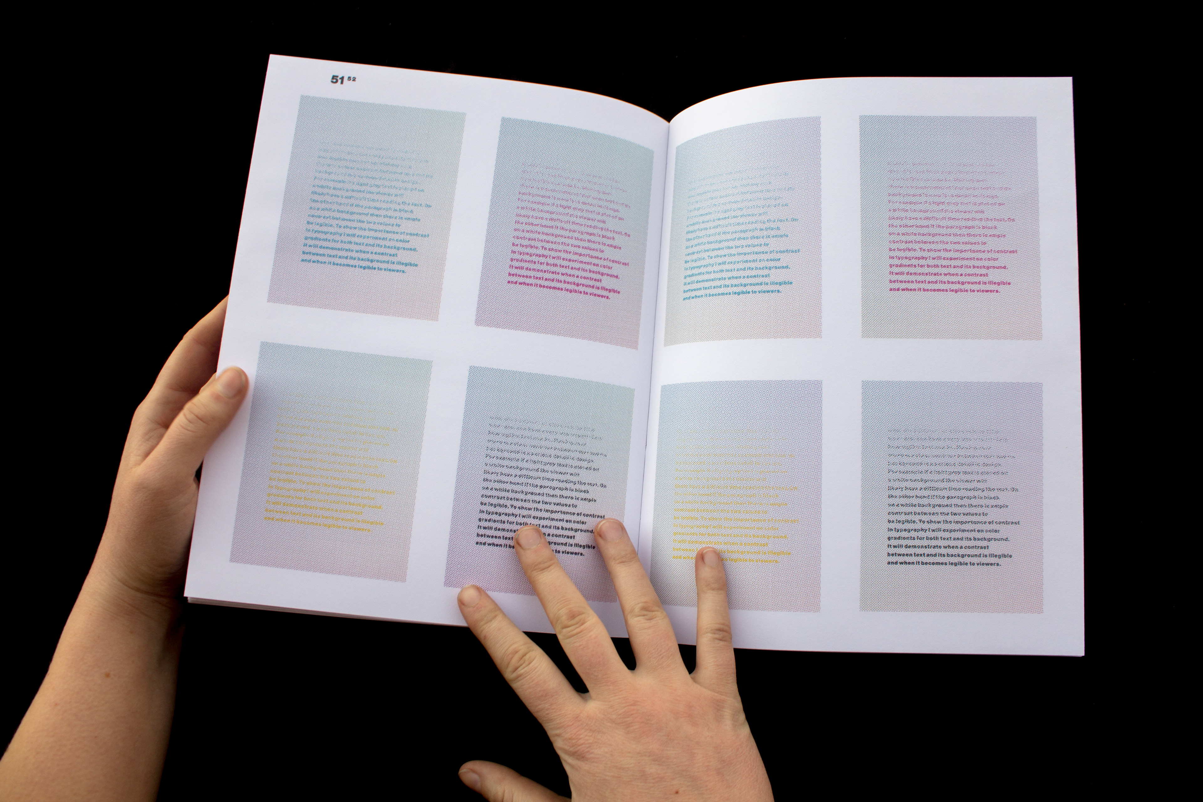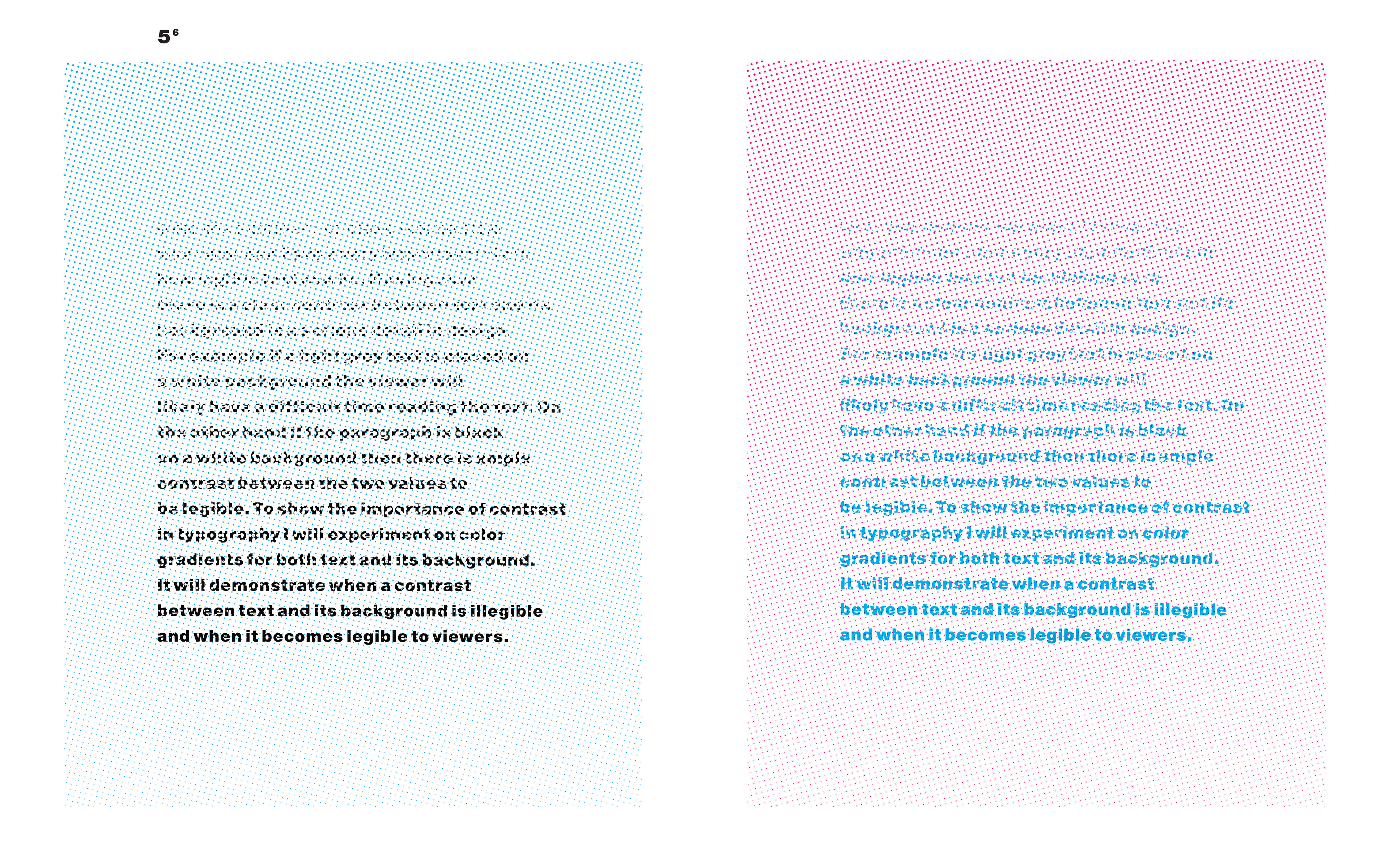

This project showcases the way color can have a very important role in how legible text can be. Making sure there is a clear contrast between text and its background is a serious detail in design. For example if a light grey text is placed on a white background the viewer will likely have a difficult time reading the text. On the other hand if the paragraph is black on a white background then there is ample contrast between the two values to be legible.
To show the importance of contrast in typography I experimented on color gradients for both text and its background. It demonstrates when a contrast between text and its background is illegible and when it becomes legible to viewers. The text and background had opposite gradient values and a halftone screen was applied to both. Different permutations with cyan, magenta, yellow, and black were used. In there end, there were 256 different permutations.